Creating a race bib isn't just about style—it’s about function too. Unlike fonts used in documents, bib fonts must be highly readable at a glance and under challenging conditions. OCR systems scan photos from multiple angles, and if the font is too decorative or unclear, it can lead to misreads and a whole host of issues. This guide is intended to help you in selecting fonts, setting sizes, spacing, and using styles—all designed to improve recognition & accuracy. You'll also see how to match high-contrast color combinations with your event theme, so your bibs are both eye-catching and easy to read. Following these best practices helps your participants find their photos quickly and gives your event a polished, professional look.
Why Bib Fonts Are Different from Document Fonts
Choosing a font for a bib isn't the same as picking one for a Word doc or PDF. Fancy or uncommon fonts might look nice but can confuse photo recognition systems. OCR readers often rotate images in all directions to find the number, and poor font choices can lead to mistakes—like reading 6006 as 9009.
Following the guidelines below for font size, weight, spacing, and style can help reduce errors and make sure your bibs are easily read by both humans and machines quickly.
| Font Style | Safe Choices | Notes |
|---|---|---|
| Sans-serif | Arial, Helvetica, Verdana, Roboto | Clean, OCR-friendly, high legibility. |
| Monospace | Courier, Roboto Mono | Not necessary, but consistent width & can help for digits. |
| Font Weight | Bold | Makes digits stand out for OCR and readable at a distance. |
| Font Size | Large (at least 1 to 2 inches high) | Bigger is better |
| Spacing | Wide letter-spacing | Avoid condensed or tightly packed fonts, critical to reading at an angle. White space between numbers critical. |
| No Outlines | Use solid fill, no stroke | Outlines reduce OCR accuracy and can cause text to look smaller and narrower and smear at angles |
Choosing the Right Font for Bib Numbers
While not every font may look flashy or trendy, choosing the right one makes a big difference in readability and scan accuracy. The fonts below are carefully selected to balance style and function—they’re clear, easy to read at a distance, and OCR-friendly. Using any of these options will help ensure your bibs look professional and perform well in photo tagging systems.
| Font Name | Style | Description |
|---|---|---|
| Arial | Sans-serif | Highly legible and widely supported. |
| Helvetica | Sans-serif | Very clean; slightly more refined than Arial. |
| Verdana | Sans-serif | Wide spacing, good for small or distant viewing. |
Design Tips for Bib Number Visibility
Prioritize clarity over decoration for better photo tagging and participant satisfaction.
We all love bold colors, eye-catching graphics, and creative bib designs—they’re a big part of your event’s visual identity. But when it comes to bib number visibility, especially in larger races that use OCR (Optical Character Recognition) to tag participant photos, clarity must take priority over flair.
Busy designs—like vibrant logos, sponsor graphics, QR codes, or beer tags—placed too close to the bib number can overwhelm the system and reduce readability. This can delay photo delivery and even worse, prevent runners from appearing in event photo searches.
To ensure fast, accurate photo tagging, here are some best practices:
✅ Bib Design Do’s and Don’ts
Keep space around the number
Avoid placing logos, QR codes, or graphics near the bib number.Use a solid, background behind numbers
Even if the rest of the bib is colorful, the number area should be either white text on a dark background or visa-versa.Avoid stylizing the numbers
Do not italicize, skew, outline (stroke), or distort the number text.Use Letters for Corral Groups
If using numbers for corrals, move the number away from the bib number to avoid mis-reads.Avoid other numbers on the bib
If you must include a year (e.g., “2025”), make sure that bib number is excluded from being assigned to a participantAvoid single-digits (1–9)
Automated systems often miss these. Use a numbering scheme that avoids assigning single digit bibs.Text should be black or dark blue
Using pastel or light-colored fonts can make the numbers appear invisible to an automated system and hard to read by human eyes.Avoid Zero based numbers [01234]
Don't start a bib number with a zero, automated tagging apps can skip it thinking its missing digits and will ignore it.
🎨 Color Contrast Matters
High-contrast, simple color pairings significantly improve readability. Not every combination will be flashy, but clean design leads to better results. Tools like a WCAG 2.1-AA compliant contrast checker or the Venngage color palette generator can help you choose accessible, on-brand text combination that still scan well.
Below are some common bib number color combination pairings to help you get an idea of what can work well.
| Background Color | Text Color | Notes |
|---|---|---|
| White | Black | Best overall for readability. |
| Yellow (light) | Black | High contrast, easy on eyes. |
| Light Gray | Black or Navy | Works well, though not ideal. |
| Neon Green | Black | High visibility in daylight. |
| Bright Orange | Black | Good contrast for daytime races. |
Avoid:
Red text on white or vice versa (low contrast in sunlight).
Dark backgrounds with dark or medium text (low OCR performance).
Gradients or patterns behind the bib numbers.
NOTE: If you prefer a dark background across the whole bib, stick with white lettering on the bib number.
Simplifying Course Management with Bib Numbering and Colors
In multi-distance races, participants often start together in waves but follow different routes and turn-around points depending on their race distance. Most events bring all runners back to a common finish area, but along the course, runners split off in various directions. This is where clear bib identification becomes a powerful tool.
Course monitors need to make quick decisions to route runners correctly and to spot top finishers by category at the finish line. You can make this much easier by assigning bib numbers and colors by distances.
1. Assigning Number Ranges by Distance
Using number blocks based on distance helps volunteers and course monitors route participants correctly at key decision points. Here are some suggestions we have seen at many events:
Fun Runs: 1000–4999
5K: 5000–9999
10K: 10000-12,999
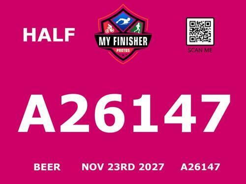
Half Marathon: 13,000–25,999
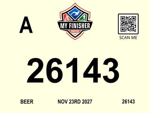
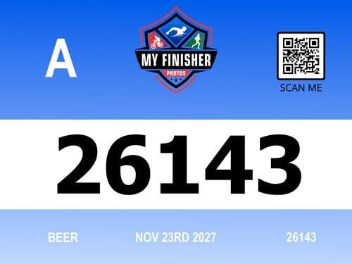
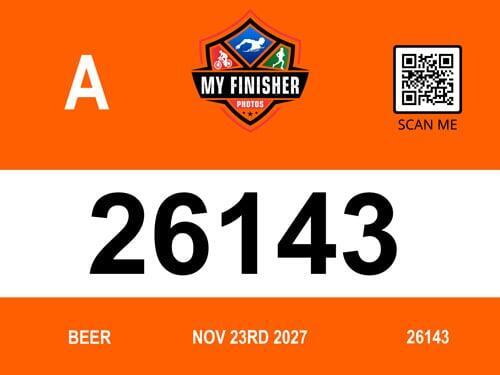
Full Marathon: 26,000+
These number blocks give spotters a quick visual cue without needing to stop a runner or ask questions. For larger events, these blocks may not work, but color coding (next section) may be the best route:
2. Use Background Colors for Quick Visual ID
Pairing the number blocks with background colors makes distance identification even easier, especially if the bib numbers are unreadable. Here’s some color ideas that could be used on your events. Here you can be creative!
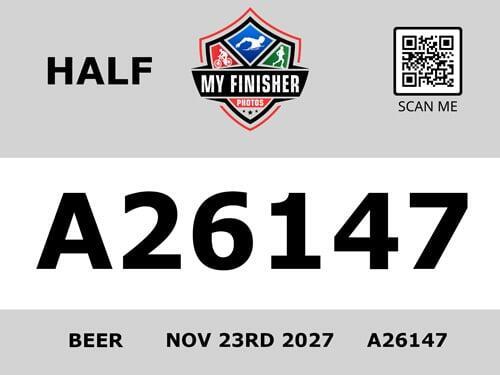
Fun Run / Untimed: Light Gray
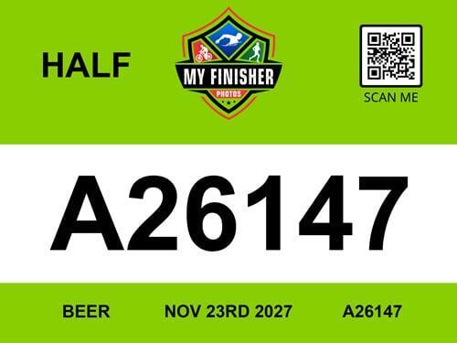
5K: Neon Green
10K: Light Yellow
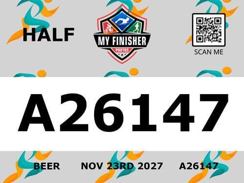
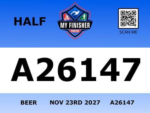
Half Marathon: Navy Blue
Full Marathon: Bright Orange
(Avoid using reds, as they can be hard to read in sunlight)
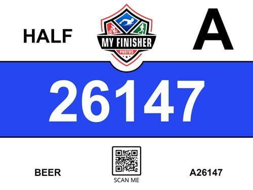
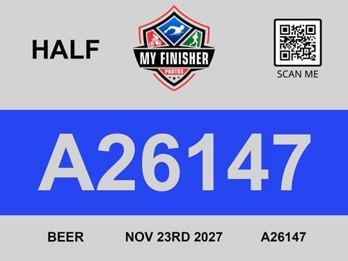
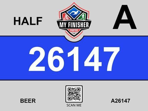
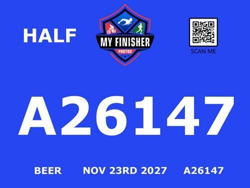
Example Bibs
Below are some examples of bibs that follow the guidelines mentioned above. They may or may not be suitable for your specific event—especially if you're working with a theme that uses colors that don’t scan well. In such cases, it's best to make the lower portion of your bib white and use solid black text in that area or a white text box with dark text. Don't discount the small BIB number in the footer, often these are detected as a backup especially when the middle of the bib is folded and the main numbers are unreadable.